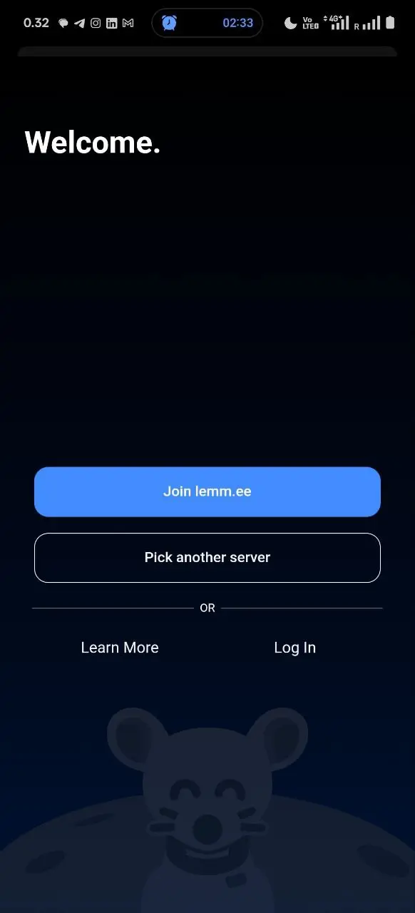

I wonder if “Log in” and “Learn more” being of equal size might be confusing?
It’s difficult to say because now that I know the button is there, it feels like only an idiot would miss it. Would need to make human experiments with people who have no experience on Lemmy. Like, make them try to log on with my username on their own phone.


I would say that having three buttons of similar size would do no harm to ease of starting for those with no preexisting account.
So:
[ Join Lemm.ee ]
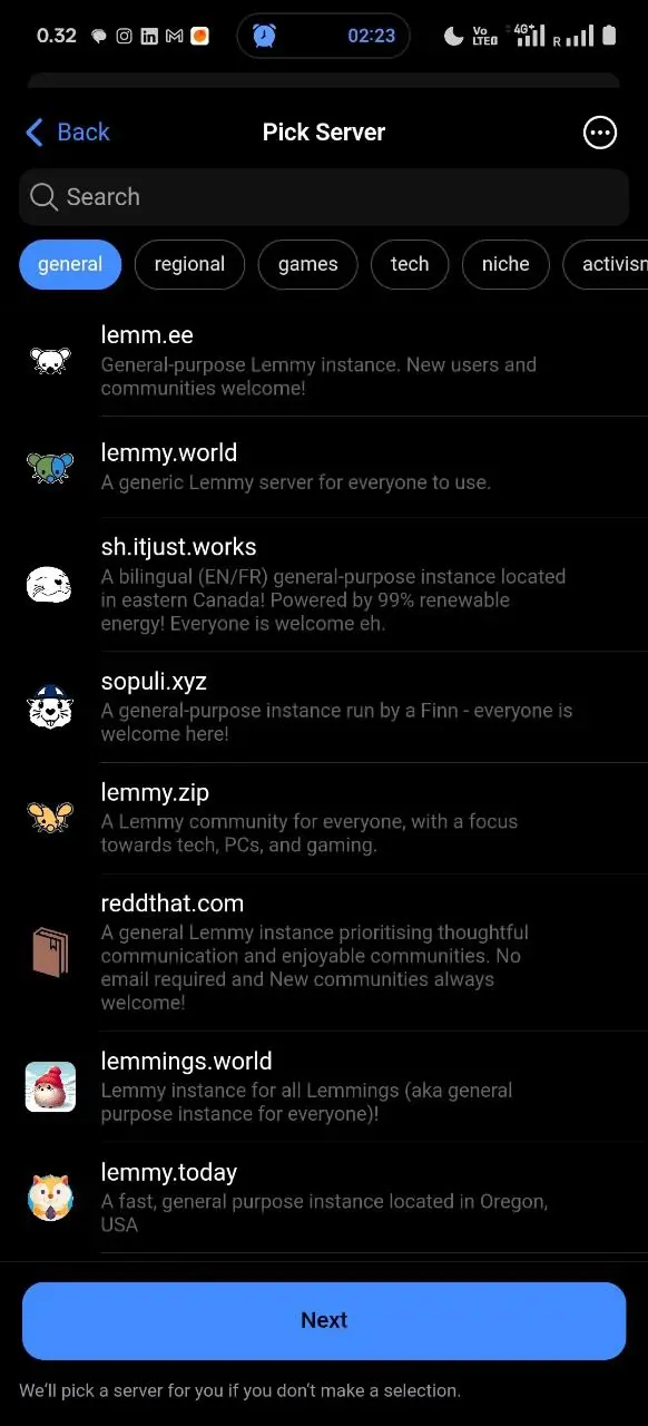
[ Join another instance ]
[ Log in to your instance ]
The login button could be on a different colour, but its shape and size should be the same as of the two other options, and, in my opinion, it should be grouped together with them.
(And indeed! Voyager is an awesome app and I’m complaining here only because I’ve seen you strive for excellent quality. Thank you very much for this awesome app! ❤️)